Website Redesign
Coosa River Basin Initiative
Role:
Team:
Tools:
Duration:
UX Researcher
UX Designer
UI Designer
Solo Project
Figma, Google Docs, Zoom, Maze
Eight Months

How can I?
Consultation
I first met with Courtney Altice, the Communications Manager at the nonprofit, Coosa River Basin Initiative, to learn their goals for their website redesign.
They wanted a focus on accessibility, visual intrigue, an intuitive interface for donations and program enrollment. There timeline wasn't specific and neither was their design preferences other than sticking to their logo and color palette.
First Look
Heuristic Evaluation
I first analyzed the platform looking at several components to see if it complied with UI standards and noted some changed to be made.
-
Keep the top nav bar consistent on all pages
-
Include a search field within the top nav for ease of use
-
Include a back button within the website, rather than just the internet browser
-
Write concise copy on the home page to not overwhelm the user
-
Keep events up to date
-
Remove the volunteer tab because there's no infrastructure
-
Include a general contact form and FAQ page
-
Links should open up to another tab, to keep website open for reference.
Inspiration Sought
Competitive and Comparative Analysis
Gaining inspiration from organizations doing similar work to gauge how they design their website and see whats working and what isn't. The companies I explored were:
-
Sound Science Creative Solutions Association
-
Dig Deep
-
Environmental Defense Fund
-
Rainforest Alliance
-
The Nature Conservatory
-
Coosa River Keeper - Alabama
Through this analysis, I noted the utilization of Infographics to educate in an engaging way, using clear and concise language for their mission, goals, process and membership.

Page Directory
Several of the sites included a way to let users what exists on the page below and an easy way to navigate towards that section.

Accessibility
Some organizations used, Recite Me, a plugin at the top right corner of their platforms, with a language translation, an audio component and screen reading option.

Gaining Perspective
User Interviews and Usability Test of Current Site
To first learn what existing perspectives on the current site are and inform future design choices, I interviewed three users, all varying in ages, to gain an understanding. The interview focused on the expectations around:
-
A nonprofits work
-
Their prior knowledge on water accessibility
-
What they would their expectations be if they became a supporting member with CRBI.
I also hosted a usability test focusing on theses main pillars:
Tasks:
-
How would you become a member?
-
How would you donate a specific amount monthly?
-
How would you go about contacting them with any questions?
-
How would you sign up for their newsletter?
-
How would you enroll in a program?
Usability Test of Original Website
After synthesizing the users insights, my main take aways were to:
-
Maintain UI consistency with a solidified brand
-
Create an exciting and less scholarly platform that calls people to action and incentivizes them to join the community movement.
-
Provide visually intriguing examples, buying into users short attention spans and underline the importance of this work and why they should care.
-
Top Nav remains on all pages even when scrolling down for easy navigation.
-
Display partnerships to enhance the idea of community building.
-
Showcase accomplishments in a visual manner
Problem Statement
Environmental Earl wants to learn about water contamination and it's effects without spending a lot of time, so they can support CRBI's work with confidence and ease.
-
How might we combined engagement with education?
-
How might we call in potential supporters into our mission and spread awareness?
User Flows
Finding the Smoothest Path
In order to successfully align my initial designs, I created user flows to map out the best path for the user to take in order to successfully complete these tasks and gain vital information.
Contact:

About Us:

Donate and Become a
Supporting Member

First Iteration
Usability Test of Lofi Wireframes and Prototype
The heat map below displays the importance of the top navigation, and informed my next iteration to implement drop down menu options from the top nav.
Upon entry, users quickly clicked on the top navigation bar.

Importance of Social Links and Contact
However, although contact was listed on the top nav bar, Users clicked on the social links on the left above the logo.
This heat map also shows the effectiveness of the page directory, where users quickly clicked on the become a member.

Design Delivered

The Top Nav directory providing Home, About Us, Our Programs, Take Action, Communication, Donate and a Search field as options.
-
Donate is a highlighted blue button to separate and attention to, as a call to action.
-
Contact made easy with a clickable email icon, phone number, and social media links along the top of the navigation and on the bottom nav as well.
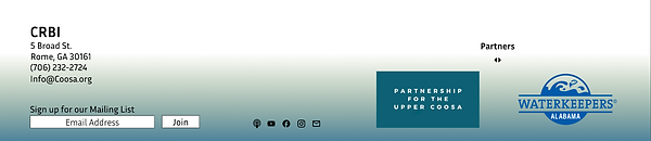
The Bottom Nav also provided accessible contact information, the ability to sign up for their newsletter, social links in the center and a partners list within a moving carousel.

Each page has it's own directory at the top, letting the user know what can be found on each page, making it easy to find information and be navigated directly to by a simply click.
The top nav also included a drop down menu sharing what can be found on each page prior to clicking.
Mission Visibility
Showcasing CRBI's initiatives directly below the top nav bar on the landing page, with visual representation and concise descriptions, with direct links to learn more about those initiatives specifically.

CRBI's concise mission statement is stated on the landing page as well, along with it's 501c3 nonprofit status is displayed to establish credibility.
A video displayed for the visual and audible users, along with their primary partnering organizations to align and build a stronger bond within that community.
Faces Behind the Work
In order to build more trust with users, I also provided a photo, bio and titles of staff members of CRBI.

Providing way to Plug In
Directly from the drop down menu, users can take action in many forms:
-
Becoming a Member
-
Plug into the community
-
Learn about the Impact of CRBI's work
-
Attend an event
-
Become an Intern
-
Volunteer
-
Shop

At the time, CRBI offered Internships through their Swim Guide Program. The two internships offered were:
-
Laboratory Manager
-
Field Technician
There are simple intake forms on the design for those to submit through.

Volunteer Form

Donating Made Easy
The final donation form provides a user journey indicator along the top, to notify the user the amount of steps to go.
Original gray scale donation wireframe
The first iteration didn't have a journey indicator, as seen on the right.
-
This form allows users to choose a popular donation amount, type in their own amount for a reoccurring annual, or monthly payment to become a member.
-
They can also decide to make a one time payment, based on their capacity.


All donations end with a thank you message, notifying the user that a confirmation email has been sent.

Lessons Learned
-
I learned to not be afraid of reimagining the current page layout and to ask pivotal questions like, how can we simplify the look to not overwhelm the user?
-
Pulling interesting colors from the established logo and working off of that to create a style guide was very helpful.
-
Asking your client the right questions at the right time can really determine the success of your designs.