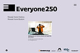
Splash Page Design
Everyone250
Role:
Team:
Tools:
Duration:
ProUX Researcher
UX/UI Designer
Project Coordinator
MINDART Team:
Wendy Michel
Gold Grey
Dayle Angeles
Figma, Zoom, Slack
Four Months

Gaining Understanding
Consultation
The founder of MINDART originally met with the client, Embrace Boston (nonprofit), to gain an understanding of the overall intention of the campaign, who's involved in this project, and what the scope of work will look like.
Learning that Everyone250 is an organization built by five founding organizations, but also has over a hundred local partners to highlight the beautiful culture, history, and stories of Boston that are typically not celebrated for the 250th anniversary of America.
Mood Board
Style Guide
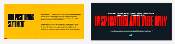
A style guide was originally provided by Proverb, giving us an idea of the direction and tone of what the campaign aims to be.
After listening back to the initial consultation meeting and looking through the playbook, I pulled inspiration for the first round of designs.

-
Taking note of the compelling photos, the low opacity on the soft colored layer and the overlaying text demanding the attention of the user.
-
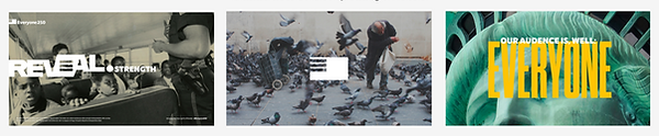
Playing with the text weight and positioning to establish visual hierarchy and visual intrigue.

-
The E-Flag was introduced in the playbook, aligning the campaign to the American flag, but with the E, representing everyone, even those whom have not been historically celebrated.

-
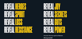
On the left, utilizing the same variety of text weight, visual hierarchy, and color overlay. "Everyone Is Here", a stand out statement for this campaign.
-
On the right, is a list of reveal statements, the concept of reveal is another stand out sentiment for this campaign.
Initial Wireframes
Based off of Existing Design System
First wireframes were created for discussion to kick off our official first meeting with the client and lay the foundation to understand the overall campaign and find any blockages that may exist.

Pages Created:
-
Home
-
About Us
-
Shop
-
Contact
-
Donate
Home

About Us
Events

Contact


Donate


-
The Contact, Donation forms and the Shop check out wireframes all with a uniform thank you and a confirmation of the transaction.
Knowing what the full website will include, I consolidated that into a splash page to be published before the full website.
Shop


Foundation Made

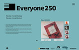
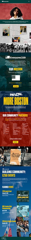
Splash Page
Consolidating the different aspects of the campaign into sections of the Splash Page was the first step.
-
Landing section
-
Reveal Statements
-
About Us
-
Events Section


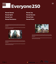
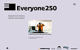
To the right you see variations of the landing page.
-
Everyone250
-
Reveal
-
Reveal 250
-
Reveal Everyone (in full page example)
This represents one of the biggest initial blockages of this campaign, landing on our identity.


Top Nav

-
The E-Flag in the left hand corner, but without the Everyone250.
-
The Hamburger Menu on the right side, with a drop down option to contact or donate to this campaign.
Bottom Nav

-
The social media links hyperlinked on the left side.
-
The founding partnering organizations logos hyperlinked along the bottom, to highlight their efforts and for users to explore.
Addressing The Blockage
Who are we? What is the Campaign?
Throughout the design process, the client was forming their identity and what the branding approach should be.
This opened up the floor for discussions and greatly impacted the design choices made along with the amount of iterations and presentations made to the client and website sub-committee.
-
How do we include EVERYONE in this campaign?
-
How do we make this campaign and interactive within this grand reveal?


Client Feedback
Juggling Client and Co-chair feedback into the Iterations

Several more versions were made to explore:
-
Various color choices
-
Copy positioning
-
Language used
-
The user journey as they scroll down the page.
We used a placeholder image above the fold, as we learned we would produce a brand story video and release it for the campaign launch party.

Clarity Found
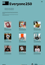
Ironed Details
Everyone250 was declared as the parent company and Reveal as the verb and it's campaign. "Reveal More Boston" is the transferable slogan that other cities can adopt in order to highlight under represented communities in their areas as well.
This plan was a sustainable way for Everyone250 to live on for years to come and have other campaigns underneath it.
-
Placeholder for Brand Story Video
-
Introduction of the "Scrapbook" section, providing users with an interactive experience, looking through visuals of community members and reading their captions. Not in old Design.
-
Concise mission statement, button for contact overlay
-
Reveal Introduction, hinting for whats to come throughout the campaign.
-
Community Partners section, button for contact overlay. Not in old Design.
-
Placeholder for Arts and Culture Summit Recap Video to gain interest in attending an event. Not in old Design.
-
Event highlight section
-
Bottom nav bar without partners listed.

Final Design
Old Design
Responsive Design
Mobile Version
This campaign is built for active engagement, building community to foster experiential learning.
Keeping this in mind, many users will be local Bostonians, but also tourists exploring the city's history for the 250th celebration of America.
The full website will include a geotagging feature to provide users the ability to know what historical sites are close by and also in proximity to events they can attend, making it easier to plan.
Brand Story Video
Throughout the design process, the team placed an image as a placeholder above the fold, where we would place the brand story video, once we filmed and edited, we published on the website.
Published for Launch Event
Brand Consistency
The final design of the splash page underscored the energy of the campaign with intention in every hue, through it's color overlaying images as the background of the website to highlight that theres more to learn and REVEAL.
-
The scrapbook section
-
Partners list
-
Brand story video
-
Arts and Summit recap video
All highlight the importance of community and that this campaign is truly coalition built.
Establishing Credibility
There are over 100 partnering organizations within this coalition built campaign. To establish trust, credibility and relatability with users, we created an affinity scrolled list of organizations with embedded hyperlinks to their own website for users to learn more and support further.

Accessibility
On the splash page we provided ALT Text, so the screen readers will properly articulate what is on the page. We made sure the design met WCAG page guidelines.
Top Nav Drop Down Hamburger Menu

Talk To Us
As this campaign is centered around community and highlighting the untold stories of Boston in the wake of the 250 anniversary of America, prioritizing participation and communication from the collective is imperative.
I designed a contact form as an overlay.
Talk To Us

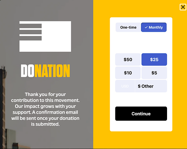
Financially Support This Campaign
Donation form displayed as an overlay pop up with typical donation amounts, or the ability to enter a custom amount with a one time or a monthly on going contribution.
Lessons Learned
-
I gained confidence in facilitation and balancing out client, co-chair and your own teams vision without sacrificing the artistic integrity of the agency I am representing.
-
Working at the intersection of design and the overall coordination of the roll out strategy of this campaign, I furthered my experience in project management and working in agile environments.
-
Serving as a reminder to always be open to changes for the betterment of the product.